Bible of Kralice
We designed the layout and typography for the first complete six-volume edition of the Bible of Kralice with original notes and in one volume. Although we have followed the original design of 1579–1594, the typesetting is contemporary, clear and elaborate to the smallest detail.
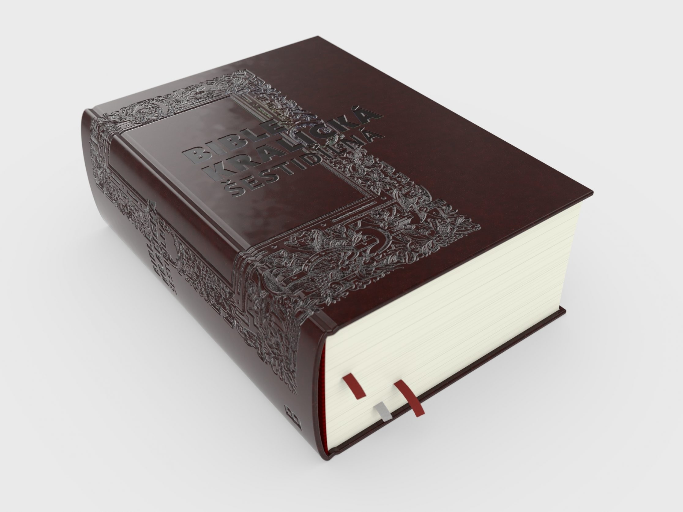
The book contains 2816 pages and is bound in a leather-covered hardcover with embossing. For practical use, the book has three bookmarked ribbons.
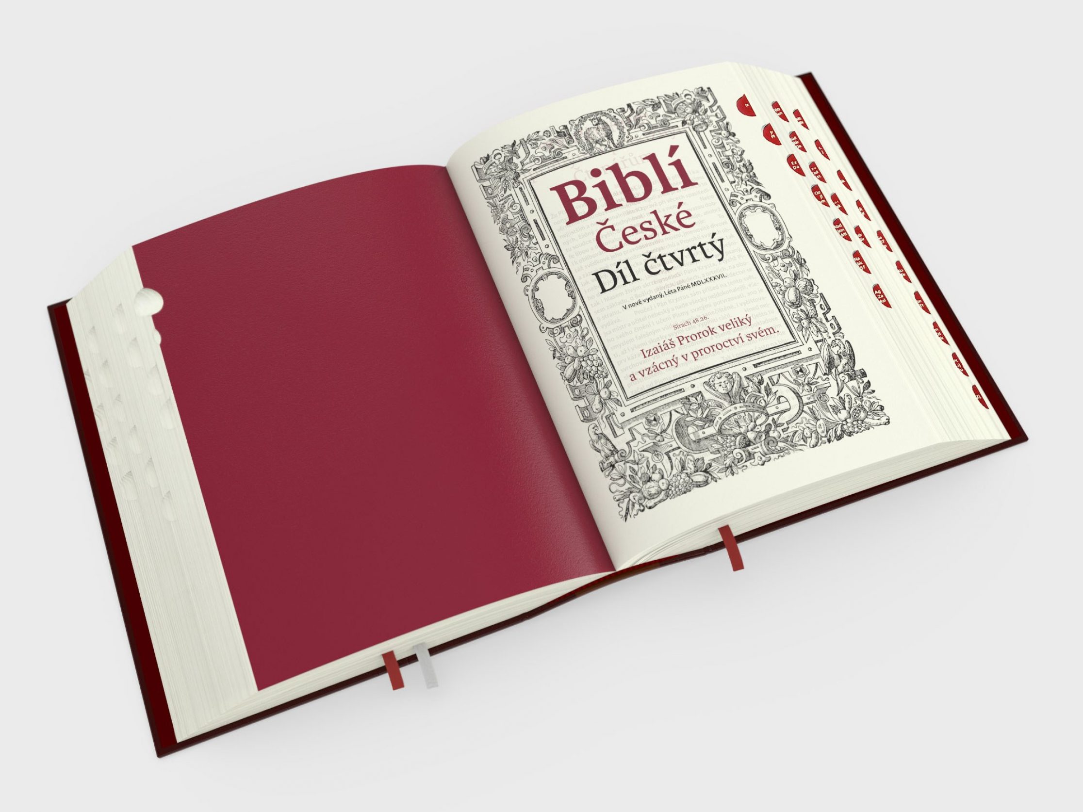
The aim of the edition is to present to the contemporary reader the complete text of the “Six-Part Bible” in such a way that all the essential linguistic features of the original printing are preserved while respecting contemporary editorial practice. The book is printed in two colours on yellowish Bible paper.
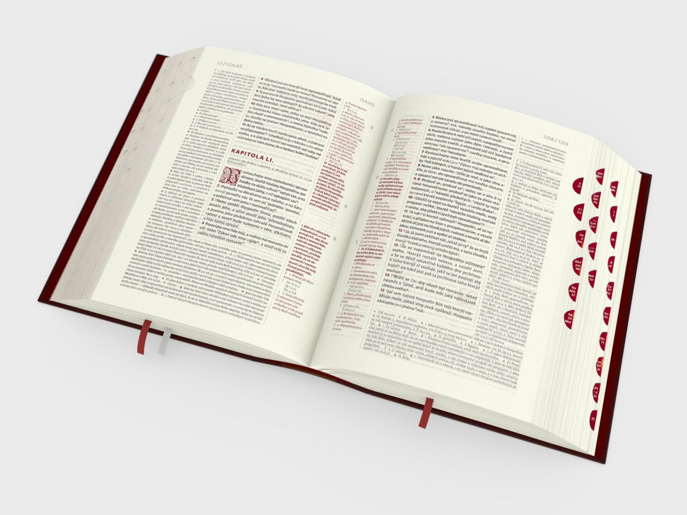
The text is arranged in the same way as in the original 16th-century edition – the main biblical text is in the middle of the page, with marginalia on the sides. If they do not fit in the narrow column on the side of the typesetting, they continue below the main text. This unique typesetting system makes full use of the space on each page.
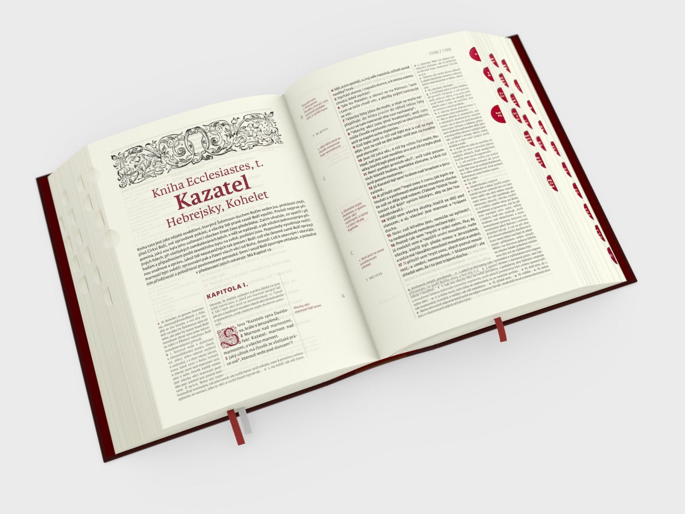
Some of the ornaments and drop caps at the beginning of chapters are taken from the original edition – due to the modification of the writing of some letters we had to add a few characters (e.g. V).
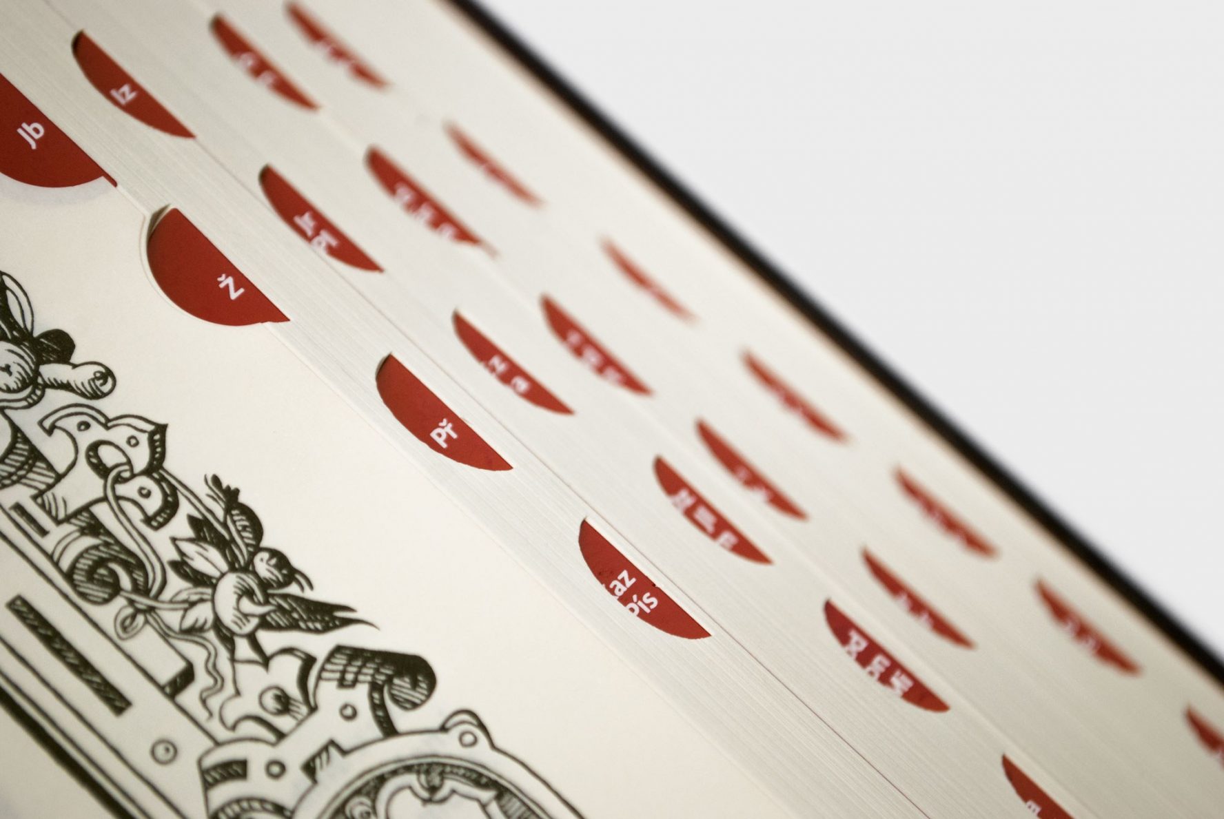
For better orientation, the book contains fingerboards that mark the beginning of each book.
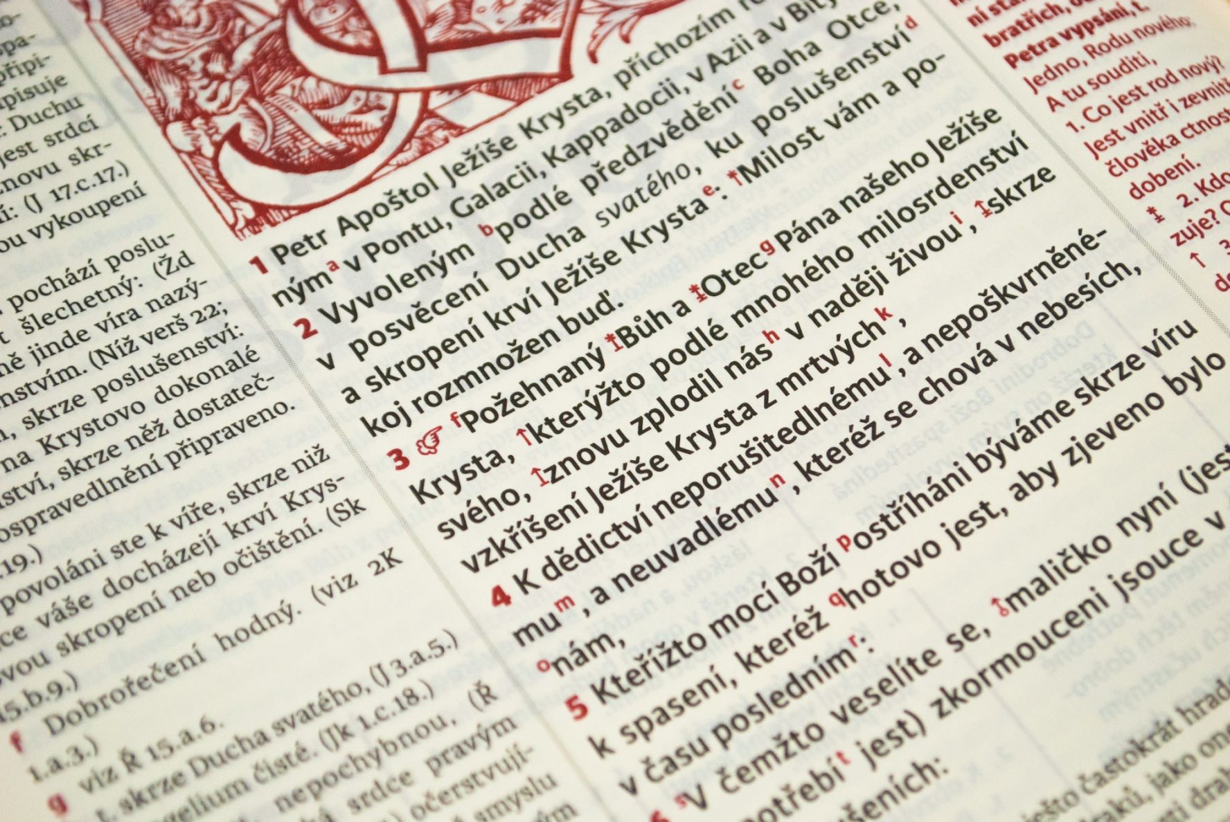
For the typesetting we used the fonts Karmina🔗 and Karmina Sans🔗 from TypeTogether, which are not only charming, but also easy to read and economical. To match the original text as closely as possible, we created a special font with typographic symbols inspired by the original typesetting.